Ceramics
Gris Perle
Gris Perle is a large-format matte grey ceramic tile of warm, oyster-grey softness. Its pearl-grey tone sits midway between cool concrete and warm plaster — a neutral of exceptional versatility that works equally in contemporary, transitional, and Scandinavian-influenced interiors. The matte surface gives the tile a natural, architectural quality that polished alternatives cannot replicate.

Gris Perle
Gris Perle is a large-format matte grey ceramic tile of warm, oyster-grey softness. Its pearl-grey tone sits midway between cool concrete and warm plaster — a neutral of exceptional versatility that works equally in contemporary, transitional, and Scandinavian-influenced interiors. The matte surface gives the tile a natural, architectural quality that polished alternatives cannot replicate.
Color
Grey
Pattern
Plain
Finish
Matte
Price Range
$
Applications
In Application
See how Gris Perle performs across walls and floors in real interior settings.
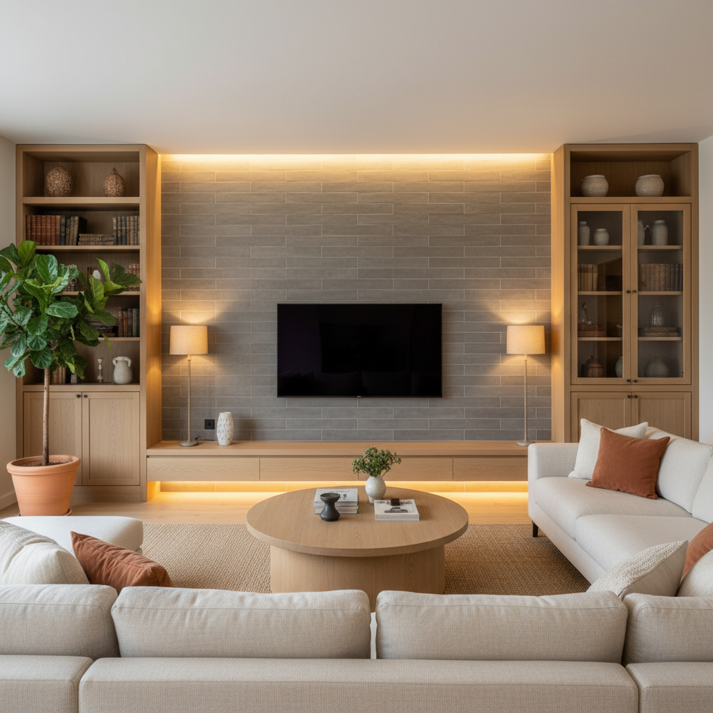
Gris Perle — Living Room Feature Wall
Gris Perle as a Wall Surface
On a feature wall, Gris Perle creates a backdrop of warm architectural neutrality. The matte pearl-grey surface absorbs light softly, creating depth without drama — a wall that supports the design composition around it without competing with furniture, art, or other materials.
It is the ideal specification for clients who want the warmth of a considered material choice without the boldness of a strong colour statement. Gris Perle is sophisticated precisely because it does not announce itself.
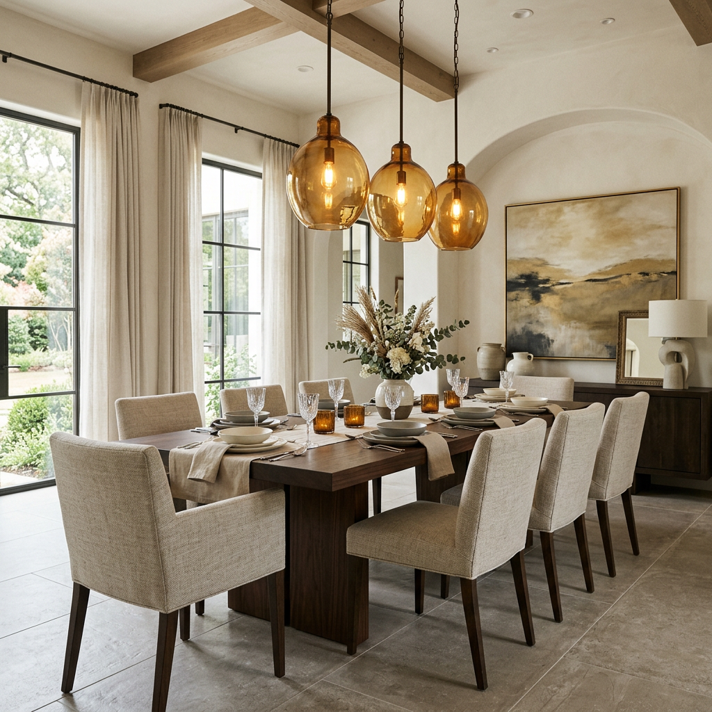
Gris Perle — Dining & Living Floor
Warm Pearl Grey Underfoot
As a floor across dining and living spaces, Gris Perle creates a warm, neutral base that accepts any design direction. The matte surface conceals dust and minor marks far more effectively than polished alternatives, making it an exceptionally practical choice for everyday family living.
The warm pearl-grey tone works beautifully with both cool whites and warm creams, dark timbers and pale oak, bold accent colours and restrained neutral palettes — making it perhaps the most genuinely versatile ceramic in the Ceraxo range.
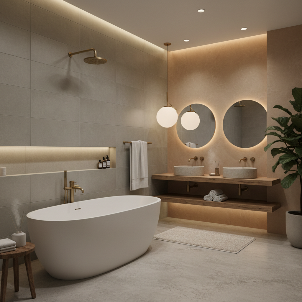
Gris Perle — Bathroom Wall
Soft Grey in the Bathroom
In the bathroom, Gris Perle creates a serene, spa-like environment of warm grey calm. The matte surface prevents the bathroom from feeling clinical while the neutral grey tone provides just enough contrast against white sanitaryware to give the space a sense of considered depth.
Paired with brushed brass or matte black fixtures, Gris Perle creates a bathroom palette of complete contemporary refinement — the kind of bathroom that photographs beautifully but is even better to live with.
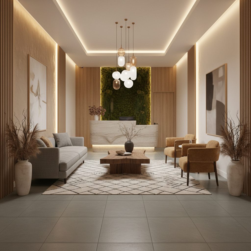
Gris Perle — Hotel Lobby
Understated Luxury in Hospitality
In boutique hotel lobbies and corridors, Gris Perle delivers a floor of understated, enduring quality. The matte pearl-grey tone creates warmth without drama — communicating luxury through restraint rather than statement.
Its exceptional durability and ease of maintenance make it ideal for the demanding foot traffic of commercial hospitality environments, while its warm neutral tone creates a welcome atmosphere from the moment guests arrive.
Customer Reviews
"Gris Perle is my most versatile specification. The warm grey matte finish works in any context and the quality is consistently excellent from Ceraxo."
Hélène Tremblay
Interior Designer, Montreal
"Full apartment renovation in Gris Perle. The warm grey tone makes every room feel cohesive and the matte finish is beautifully low-maintenance."
Stéphane Bouchard
Homeowner, Plateau
"A genuinely versatile matte grey. The pearl tone is warm enough to avoid the coldness of some grey ceramics while remaining completely neutral."
Josée Côté
Architect, Mile End
"Good consistent product at a fair price point. Large format cuts well and the matte finish is forgiving on installation. Reliable for both residential and light commercial."
Rémi Lachance
Contractor
"Bathroom walls and floor. The warm grey is so much more inviting than pure white or cool grey. Exactly the mood we were looking for."
Amélie Dorion
Homeowner, Outremont
"Used across our boutique hotel rooms. The neutral grey tone works with our brand palette and the matte finish handles housekeeping well."
Patrick Bisson
Hotel Developer